Custom fonts impact layout shifting. Fix it to get a better user experience and improve SEO, including Cumulative Layout Shift (CLS).
Custom fonts impact performance through delayed text rendering and layout shifts. This is because they have to be downloaded and the layout must be repainted again. When a visible element on your website changes size or location, it might have an impact on the position of the content surrounding it. This is known as a layout shift.
Note that if a web font has not loaded, browsers typically delay text rendering.
How custom fonts affect layout shifting and what to do about it
The browser has to asynchronously download a custom web font, which frequently results in text changing in size or spacing after loading and applying new fonts. This produces a shift in the layout as fonts get updated because the layout needs to be recalculated.
What the page look like before and after rendering custom web fonts?
Compare two scenarios. One that uses system fonts (here Mac OS, SFNS System San Francisco Display), and the second that uses the custom Inter fonts.

Strategies for minimizing layout shifts with custom fonts
This directive, which is located in your @font-face declaration, instructs the browser to fall back to the system font in case the web font is not accessible at the time that text is rendered (plus 100 ms). This indicates that subsequent page loads should render using the web font, as it will have been downloaded and made accessible in cache, but uncached page loads may still use the fallback font. There are other choices, as seen in the illustration below:
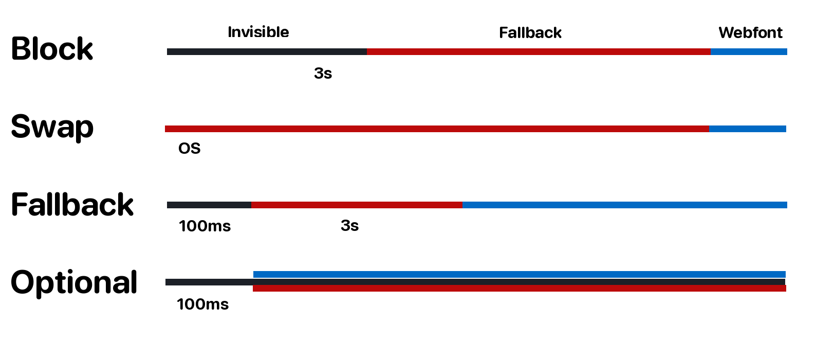
- block: Gives the font face a short block period (3s is recommended in most cases) and an infinite swap period.
- swap: Gives the font face an extremely small block period (100 ms or less is recommended in most cases) and an infinite swap period.
- fallback: Gives the font face an extremely small block period (100 ms or less is recommended in most cases) and a short swap period (3s is recommended in most cases).
- optional: If the font can be loaded
immediately
, such that it’s available to be used for thefirst paint
of the text, the font is used. Otherwise, the font is treated as if its block period and swap period both expired before it finished loading. If the font is not used due to this, the user agent may choose to abort the font download or download it with a very low priority. If the user agent believes it would be useful for the user, it may avoid even starting the font download and proceed immediately to using a fallback font.
@font-face@font-face {
font-display: optional;
font-family: "Inter";
font-style: normal;
font-weight: 200;
src: local("Inter ExtraLight"), local("Inter-ExtraLight"), url("/static/assets/fonts/Inter-ExtraLight.woff2") format("woff2"), url("/static/assets/fonts/Inter-ExtraLight.woff") format("woff");
}Enhancing font loading and rendering for better user experience and SEO
Using custom fonts isn’t something that should be avoided. However, there are consequences to rendering custom web fonts that impact SEO and the user experience. The following points can be considered for further improving the loading and rendering of fonts:
- Cumulative Layout Shift (CLS) is a Google metric that measures a user experience event and became a SEO ranking factor in 2021. Unoptimized rendering of custom fonts may impact CLS.
Preconnect to critical third-party origins. When a
<link>hasrel=preconnect, it informs the browser that you want the connection to open up as soon as possible and that your page will be connecting to another site. Resources will load faster since they have already finished setting up by the time the browser requests them. This, in turn, eliminates roundtrip latency and saves time for users.Example code section for custom web fonts pulled from Google Fonts <link rel="preconnect" href="https://fonts.googleapis.com"> <link rel="preconnect" href="https://fonts.gstatic.com" crossorigin>- As much as possible, fetch custom fonts from a different domain or subdomain. A browser can only connect to the same host in parallel, with a maximum number of connections per host varying from 2 to 13, depending on the browser used. The browser will simply queue requests beyond a certain limit in an internal queue and process them when an active request ends and a
slot
opens up. This can be improved by serving custom fonts from a subdomain or third-party domain, e.g., a CDN. - Use
woff2file format.woff2uses Brotli compression, which reduces data by 30% better thanwoff, resulting in faster speed and less data to download. Use subset fonts through the
unicode-rangedirective, which allows you to set a specific range of characters to be downloaded from a font (embedded using@font-face) and made available for use on the current page. A subset font only contains a subset of the original font file’s characters, which significantly reduces the file size of a font.Example code section for custom web fonts with specifying unicode range /* latin */ @font-face { font-family: 'Inter'; font-style: normal; font-weight: 300; font-display: optional; src: url(https://fonts.gstatic.com/s/inter/v12/UcC73FwrK3iLTeHuS_fvQtMwCp50KnMa1ZL7W0Q5nw.woff2) format('woff2'); unicode-range: U+0000-00FF, U+0131, U+0152-0153, U+02BB-02BC, U+02C6, U+02DA, U+02DC, U+0304, U+0308, U+0329, U+2000-206F, U+2074, U+20AC, U+2122, U+2191, U+2193, U+2212, U+2215, U+FEFF, U+FFFD; }- To reduce the Cumulative Layout Shift (CLS) impact even further, you can use the new
size-adjustattribute. You may now change the scale of a web font as it loads to normalize the font sizes in the document and eliminate layout shifts when switching between fonts. - Use system fonts as a fallback for the custom web font. Example font family:
"Inter", -apple-system, BlinkMacSystemFont, "Segoe UI", Roboto, "Helvetica Neue", Arial, sans-serif;
Additional considerations for optimizing font performance and user experience
There are cases that are worth mentioning here. They aren’t directly connected with the issue described in the article, but they may still be useful while debugging.
Your fonts may not be loaded, but this doesn’t have to always be an issue. The reason is that the browser may decide not to load the custom fonts when they aren’t used on the page.
To ensure that the browser will always load all desired fonts (asynchronously), you may use the local fonts and the following technique:
Load fonts using JavaScript FontFace API (function () { const loadCustomFonts = async () => { if (typeof document.fonts === 'undefined') { return; } const fonts = [ new FontFace('Inter', 'url(assets/fonts/Inter-Regular.woff2)', { style: 'normal', weight: '400' }), new FontFace('Inter', 'url(assets/fonts/Inter-Medium.woff2)', { style: 'normal', weight: '500' }), new FontFace('Inter', 'url(assets/fonts/Inter-SemiBold.woff2)', { style: 'normal', weight: '600' }) ]; const fontsToLoad = fonts.map((font) => { document.fonts.add(font); return font.load(font); }); try { await Promise.all(fontsToLoad); } catch (err) { console.error('Unable to load custom fonts', err); } } loadCustomFonts(); })();- When
font-display: optional;is used with a disabled cache, then the custom fonts won’t be loaded.
What fonts do not produce layout shifts?
There are several fonts that are designed to minimize or eliminate layout shifts, which can be particularly useful when it comes to web design. Some examples of these fonts include:
- Open Sans: This font is designed to be highly legible and has a consistent x-height, which means that the letters are more evenly spaced and less likely to cause layout shifts.
- Lato: This font has a clean and modern design, and its letters are well-spaced and balanced, which can help to reduce layout shifts.
- Montserrat: This font has a sleek and contemporary look, and its letters are designed to be highly legible and evenly spaced, which can help to minimize layout shifts.
- Roboto: This font is widely used in web design and is known for its clean and modern look. It also has a consistent x-height, which can help reduce layout shifts.
- Arial: This font is a classic choice for web design and is known for its legibility and even spacing, which can help to minimize layout shifts.
It’s worth noting that while these fonts are designed to minimize layout shifts, they may not completely eliminate them. Other factors, such as the size and weight of the text, the line height, and the overall design of the page, can also affect the likelihood of layout shifts occurring.
Comments