Boost your online presence with our guide to web accessibility and effective use of font italics. Learn best practices for improving the user experience.
Italic fonts can have both positive and negative impacts on accessibility, depending on how they are used. Italics can be appropriate in some cases, but with some fonts, it can make your text unreadable.
Are italic fonts always inaccessible?
It is not always bad for accessibility to use italics. But many people find it difficult to read italicised text in blocks, especially those who experience dyslexia. Because of this, some companies forbid the use of italics in online text altogether. This is not a good approach, though, since it can remove a significant amount of the semantic richness from text, making it harder to read and consequently less accessible. Rather, the most overall benefits will come from the careful application of italics.
Use classic sans serif fonts if your website doesn’t already include dyslexia-friendly fonts. Study at the University of Michigan Good Fonts for Dyslexia
reveal that individuals with dyslexia do better when reading in sans serif, monospaced, and roman font styles. On the other hand, italic typefaces make text harder to read.
It’s important to note that many conventions for the use of italics are enshrined in international standards, including BS 5605 (Recommendations for citing and referencing published material), BS ISO 690 (Guidelines for bibliographic references and citations to information resources), and ISO 999 (Guidelines for the content, organization and presentation of indexes).
The impact of italic fonts on web accessibility
When it comes to web accessibility, it’s crucial to consider the overall readability and legibility of the content. While italics can be used to add emphasis or convey meaning, it’s recommended to use them judiciously to ensure maximum accessibility and consider alternative ways to achieve emphasis, such as using bold or underlined text.
To ensure accessibility, it is recommended to use font styles that are easy to read and do not hinder the legibility of the text.
It is worth mentioning that browser should expose <em> element through the Accessibility API, but unfortunately it is not implemented widely in the browsers yet. Hence, some screen readers may not announce italic (and bold as well) tags by default, although some can be configured to point out bold and italics.
| Browser | Accessibility API exposure details |
|---|---|
| Chrome, Version 119.0.6045.199 (Official Build) (x86_64), MacOS, Ubuntu, and Windows | 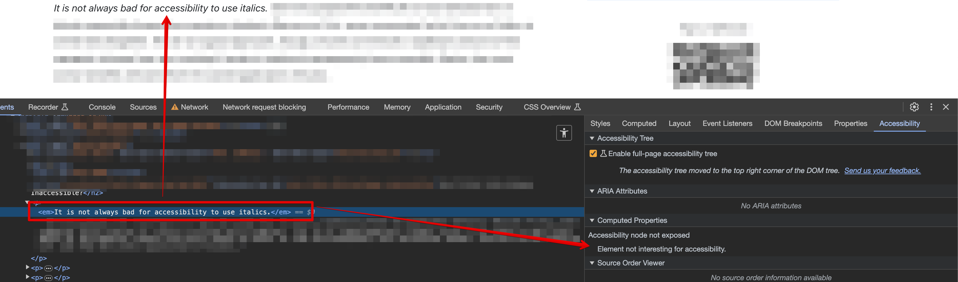 |
| Firefox, 120.0.1 (64-bit), MacOS, Ubuntu, and Windows | 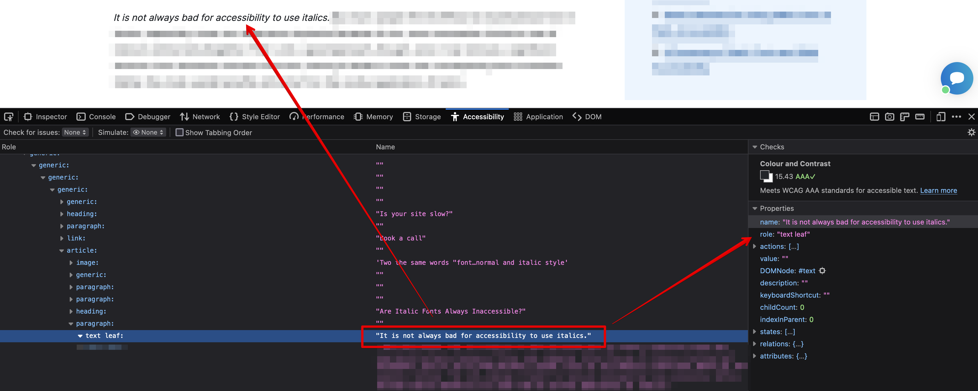 |
| Safari, Version 17.1.2 (19616.2.9.11.12), MacOS | 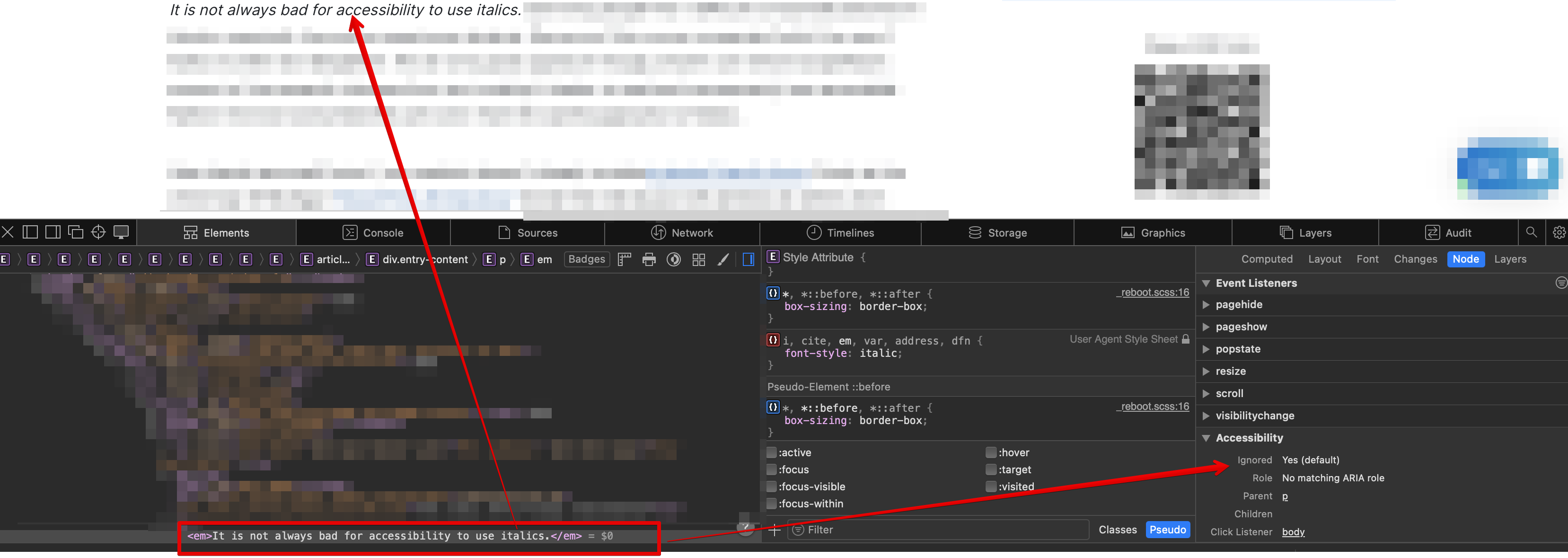 |
Semantic HTML refers to the use of HTML elements that describe the meaning of the content they contain, rather than just its presentation.
Good example: <em>This is emphasised correctly</em>.
Bad example: <span style="font-style: italic;">This is emphasised incorrectly</span>.
The bad example emphasises only visually through the CSS and <span> does not provide any semantics behind it.
Comparing three font families for readability: OpenDyslexic 3, Arial, and Tahoma
Here is an example of the text rendered using three different font families: OpenDyslexic 3, Arial, and Tahoma.
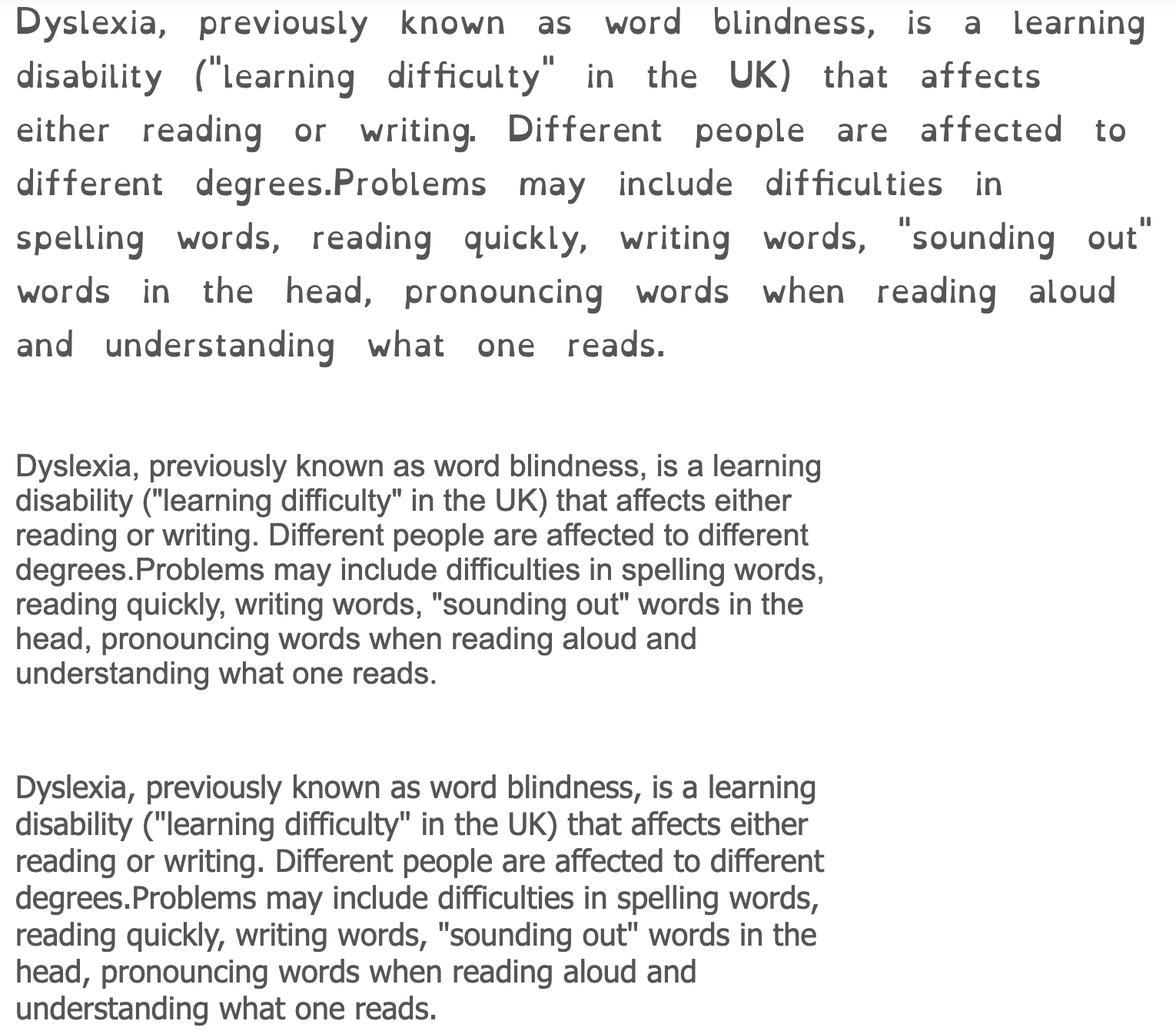
Source of the above definition of dyslexia: Wikipedia’s comprehensive overview of dyslexia.
Best practices for using italic fonts in web accessibility
Here are some guidelines regarding the use of italics for accessibility:
- Use italics for emphasis: Italic fonts can be used to emphasize important information, making it easier for users with visual impairments to distinguish critical content from less important information.
- Avoid excessive use of italics: Using excessive italics can make the text difficult to read, as it can create a sense of visual noise and make it harder for users to focus on the important information. Especially for individuals with dyslexia or other reading disorders. It is best to use italics sparingly and only for specific purposes.
- Consider alternative ways to emphasize text: Instead of relying solely on italics for emphasis, consider using other methods such as bold formatting or changing the font size or color. This can provide visual contrast and make the emphasized text stand out without relying solely on italics.
- Avoid using italics for decorative purposes: Italics should not be used solely for design or decorative purposes. This can make the text harder to read and may not be accessible to all users.
- Consider the needs of individuals with low vision or reading disabilities: Some individuals with low vision or reading disabilities may find it difficult to read italicized text as the slanted letters can be confusing or difficult to distinguish. It is important to consider their needs and ensure that the font style used is accessible to a wide range of users.
- Use consistent formatting: If italic fonts are used inconsistently throughout a document or website, it can create confusion and make it more difficult for users to navigate the content.
- Avoid using italics for large blocks: Blocks of italics are difficult to read, so consider other formatting and design options.
- Use for foreign words: Italics contrast words and phrases that are not in the primary language of the content with the surrounding text. Example:
The internet offers plenty of advice on the rules of savoir-vivre, etiquette, good manners.
- Dyslexia Friendly Fonts: If you need dyslexia-friendly fonts, read more about them in
Dyslexia Friendly Fonts: The Top 10 Fonts for Dyslexia
.
Please note that these guidelines are general recommendations for accessibility. It is always a good practice to test the readability of your content with different font styles and consult accessibility guidelines such as the Web Content Accessibility Guidelines (WCAG) for specific requirements.
A summary of italic fonts and web accessibility
In summary, the impact of font style italic on accessibility is a complex issue. It’s important to consider the readability and legibility of the text for different users and to use italics sparingly and purposefully.
Comments