Fixing render-blocking fontsArticle contains
  1. Techniques that can be used to avoid render-blocking fonts
  2. Using system fonts or fonts that are already loaded on the user's device
  3. Using CSS font loading APIs that allow the page to render before the font is loaded
  4. Specifying a fallback font that can be used until the main font is loaded
  5. Load fonts asynchronously using a technique called font loading with a media query hack
  6. Results and testing pages
Virtual keyboard with virtual monitor that presents the code. Image by Gerd Altmann from Pixabay.

Fixing render-blocking fonts

Render-blocking fonts refer to fonts that prevent a web page from rendering or displaying its content until the font has been loaded. This can cause a delay in the page loading, resulting in a slower user experience.

When a web page is loaded, the browser reads the HTML and CSS files to determine the layout and styling of the page. If a font is specified in the CSS, the browser will typically wait for the font to be loaded before rendering the page. This is known as a render-blocking font because it blocks the rendering of the page until the font is available.

Render-blocking fonts can be a problem because they can cause a delay in the page loading, especially if the font is large or takes a long time to load.

To avoid render-blocking fonts, let’s explore techniques to fix the issue.

Continue reading “Fixing render-blocking fonts”
Optimizing Background Videos for Fast Loading: Tips and Strategies for Improved User ExperienceArticle contains
  1. Reduce the file size
  2. Remove audio from muted videos
  3. Convert to HTML5 supported formats
  4. Optimize the video's dimensions and aspect ratio for the page layout
  5. Lazy loading for video, including CSS background
  6. Preload the video
  7. Use a poster image
  8. Use a video hosting platform that supports adaptive bitrate streaming
An old, open briefcase with a mini beach and sun in it

Optimizing Background Videos for Fast Loading: Tips and Strategies for Improved User Experience

Adding videos to your website can sometimes be a double-edged sword. Web users love high-resolution videos, but if your website isn’t optimized to handle them, such content can cause performance problems.

When it comes to optimizing background videos for fast loading, there are several steps you can take.

Continue reading “Optimizing Background Videos for Fast Loading: Tips and Strategies for Improved User Experience”
How do you measure the success of the website project?Article contains
  1. Key points of measuring the success of the website project
  2. What metrics and analytics do you use to track and report the website's performance and impact?
  3. Can data-driven decisions really optimize my website's user experience, content, and marketing strategies?
Fixing layout shifting brought on by custom fontsArticle contains
  1. How custom fonts affect layout shifting and what to do about it
  2. What the page look like before and after rendering custom web fonts?
  3. Strategies for minimizing layout shifts with custom fonts
  4. Enhancing font loading and rendering for better user experience and SEO
  5. Additional considerations for optimizing font performance and user experience
  6. What fonts do not produce layout shifts?
Letter with sample fonts

Fixing layout shifting brought on by custom fonts

Custom fonts impact performance through delayed text rendering and layout shifts. This is because they have to be downloaded and the layout must be repainted again. When a visible element on your website changes size or location, it might have an impact on the position of the content surrounding it. This is known as a layout shift.

Note that if a web font has not loaded, browsers typically delay text rendering.

Continue reading “Fixing layout shifting brought on by custom fonts”
Improved lazy loading for image, video, and audioArticle contains
  1. Optimizing lazy loading for images, videos, and audio: Best practices and strategies
  2. The solution: Streamlining lazy loading for enhanced user experience
  3. Demo: Visual example of improved lazy loading in action
  4. Performance enhancement with lazy loading: Does it really work?
How to compress the image on the client side before uploadingArticle contains
  1. Introduction: Understanding the need to compress images on the client side before uploading
  2. Should you compress images before uploading? Exploring the benefits of using JavaScript
  3. Step-by-step guide: Compressing images with JavaScript before uploading
  4. Limitations: Factors to consider when compressing images on the client side
  5. Workable example: Demonstrating image compression with JavaScript
Easy way to reduce Google Chrome's memory and CPU usageArticle contains
  1. Memory Saver
  2. Energy Saver
  3. How do I turn Memory Saver, and Energy Saver on or off?
  4. Final word
Accessibility and PerformanceArticle contains
  1. Unveiling user impacts: Understanding the relationship between Accessibility and Performance
  2. The technical side of Accessibility and Performance
  3. The power of Performance: How it influences Accessibility for users
  4. Optimizing for both Accessibility and Performance
  5. Conclusion: Balancing Accessibility and Performance for a better user experience
Two snails on a piece of wood

Accessibility and Performance

Performance and accessibility are two important aspects of web development. Since they are related, optimising one might result in improvements in the other.

Web performance is all about making websites fast: loading, rendering, and interacting.

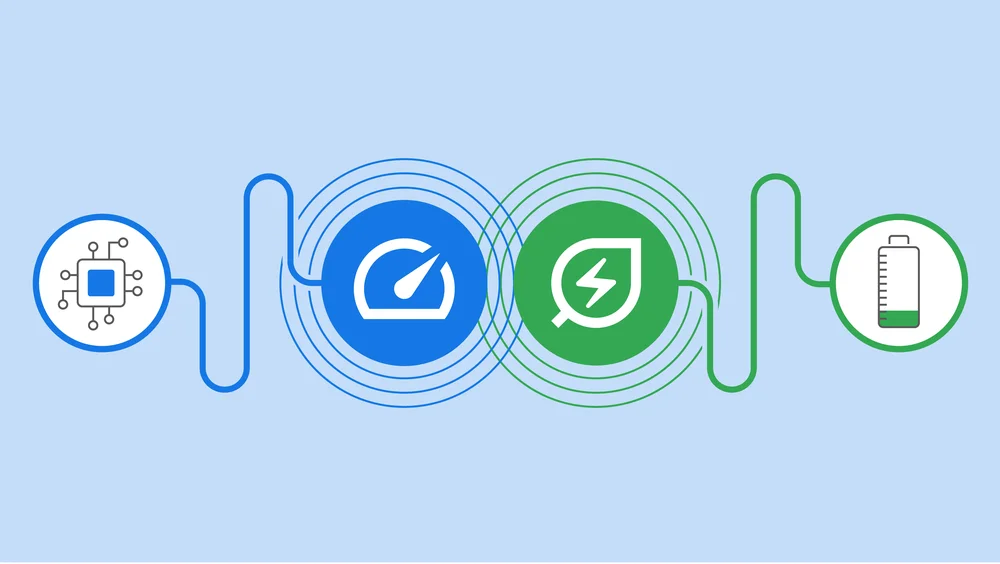
When pages load slowly or have a lot of content to load, the experience can be very clunky and unpleasant for all users. More resources to download also mean more data that needs to be transferred through the network and processed. Let’s explore the user and business impact and how this could be improved.

Accessibility focuses primarily on making websites usable for people with disabilities. However, many accessibility requirements also improve usability for everyone. For example, good color contrast means all users can see your content no matter what device they’re using or the lighting in their surroundings.

Continue reading “Accessibility and Performance”
Determining viewport size - small, medium and large - using CSSArticle contains
  1. CSS code for determining viewport size
  2. How to get the value of the viewport size
  3. Practical example of viewport size determination
Computer and mobile phone

Determining viewport size – small, medium and large – using CSS

To get the viewport size using CSS in JavaScript, you can utilize the getComputedStyle method to access the content of a pseudo-element, such as ::before, which can be defined in your CSS media queries. This allows you to dynamically determine the viewport size category (e.g., small, medium, large) based on the current screen width, enhancing responsive design capabilities.

The browser viewport is the screen that actually shows the webpage. Determining its size might be handy when we want to provide some specific features for the viewport size.

Continue reading “Determining viewport size – small, medium and large – using CSS”
Lazy loading CSS background images for better website loading performanceArticle contains
  1. Can you lazy load background images?
  2. Set the goals for lazy loading CSS background
  3. The solution
  4. Workable example
  5. Download package
  6. Discussions
  7. Improved lazy loading for images, video, and audio
  8. How to set lazy loading images on other libraries
Collection of pictures in frame

Lazy loading CSS background images for better website loading performance

Every single HTTP request decreases loading performance. For a simple image, the attribute loading="lazy" can be used in order to defer the loading of off-screen images until the image appears on the screen. Lazy loading of images improves performance by reducing initial page load time, initial page weight, initial page rendering, and system resource usage.

  1. Initial page load time – with lazy loading, the page is loaded faster because only images that are visible on the screen are loaded.
  2. Initial page weight – because images that aren’t visible won’t be downloaded. Hence, the whole page weight will be smaller.
  3. Initial page rendering – less images to render, the faster the whole page will be rendered for the user.
  4. System resource usage – this refers to less resource usage like CPU, network, etc.
Continue reading “Lazy loading CSS background images for better website loading performance”