Description
This rule determines if text and controls have enough color contrast.
Text and interactive elements need to have high contrast so that the content is readable to everyone. High contrast especially benefits site visitors who may have low vision, color blindness, or aging. It can also help mobile users see content even if the screen is affected by sun glare.
The W3C Web Content Accessibility Guidelines 2.0 define specific contrast ratios that must be met in order to comply at particular levels. In order to meet the guidelines at Level AA, text or images of text must have a contrast ratio of at least 4.5:1 (or 3:1 for large text).
Contrast is one of the most crucial factors to consider because it is the first thing people see when engaging with your content.
Note that the rule also displays WCAG 3.0 APCA computed contrast. The Advanced Perceptual Contrast Algorithm (APCA) is a new way to compute contrast based on modern research on color perception. Compared to AA/AAA guidelines, APCA is more context-dependent. APCA is a public beta, under active development.
The contrast is calculated based on the following features:
- Spatial properties (font weight and text size)
- Text color (perceived lightness difference between text and background)
- Context (ambient light, surroundings, and intended purpose of the text)
Why is a contrast ratio of 4.5:1 recommended for color contrast, and what are the exceptions to this rule?
The rationale is based on a) adoption of the 3:1 contrast ratio as the minimum acceptable contrast for normal observers, in the ANSI standard, and b) the empirical finding that in the population, visual acuity of 20/40 is associated with a contrast sensitivity loss of roughly 1.5 [ARDITI-FAYE]. A user with 20/40 would thus require a contrast ratio of 3 * 1.5 = 4.5 to 1. Following analogous empirical findings and the same logic, the user with 20/80 visual acuity would require a contrast of about 7:1.
There are some exceptions to this rule, including:
- Large text (defined as 14 points and bold or larger, or 18 points or larger) must have a contrast ratio of at least 3:1.
- Text or images of text that are part of an inactive user interface component, that are pure decoration, that is not visible to anyone, or that are part of a picture that contains significant other visual content, have no contrast requirement.
- Text that is part of a logo or brand name has no minimum contrast requirement.
How to fix it
- Review the background and foreground text colors to ensure they meet the requirements.
- Use the tool Color Contrast Finder to find the closest colors that pass the color contrast ratio.
- Use the tool Contrast text on image to check the contrast for the text that overlaps the image.
Known Limitations
Determining color contrast ratio programmatically is limited due to technical constraints (browser doesn’t provide enough information) or for certain scenarios like:
- The text on an image.
- The background has a gradient.
- The
mix-blend-modeCSS property is used. - There is no defined default background for the root HTML element, at least.
Hence in some cases, a manual check is required to ensure the color contrast matches the requirements.
Why is the contrast error being reported even though I can see a white background and text on it?
The root cause is that your element or any parent element up to the HTML root element doesn’t have defined background color. What does it mean?
To calculate the color contrast, foreground and background color is needed. When a tested element has the background color with an <alpha-value>, where the number 1 corresponds to 100% (full opacity), then the rule looks through all parent HTML elements up to the HTML root element to find the background color (without opacity) that could be used for color contrast calculation. If no color is found then the contrast ratio cannot be calculated.
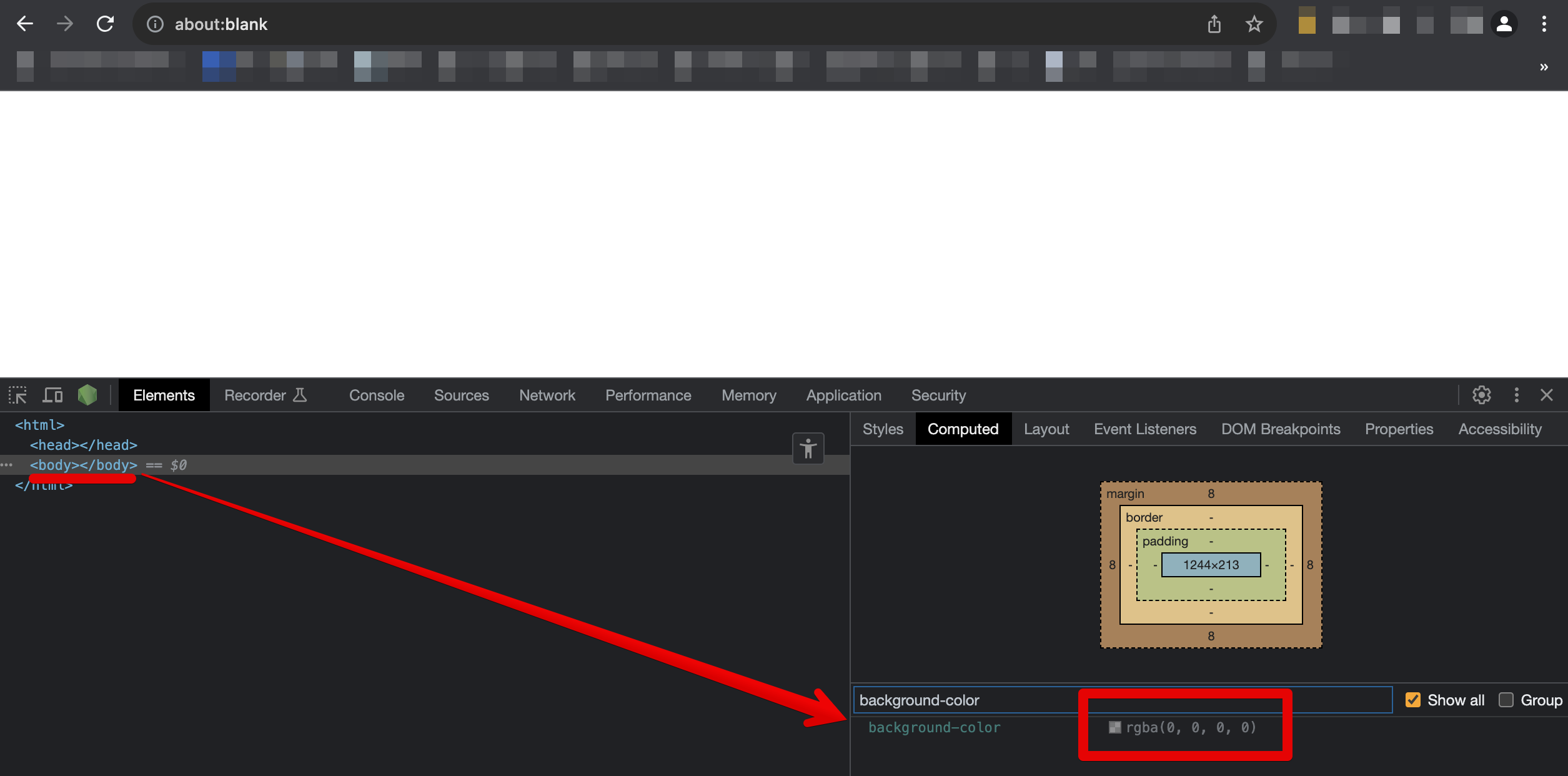
But wait a minute. After all, you see a white background and text on it. Unfortunately, this is because the default background color is displayed as white, when in fact the browser stores the color as rgba(0, 0, 0, 0). Hence the color contrast can’t be calculated because your root HTML element (e.g. <html>) has defined rgba(0, 0, 0, 0) and opacity value below 1. Which leads to no calculation and moves to the manual verification step.
Therefore, it is very important to define the default background color on the HTML root element or at least <body>. See the screenshot from about:blank page:
The solution to that is to always set default background color for the page. Either on <html> or <body> HMTL element. Example: body { background-color: #fff; }
Standard
Accessibility, WCAG 2.1, Success Criterion 1.4.3 Contrast (Minimum)