| Rule id | Description | WCAG Reference |
|---|---|---|
distinguishable-links | The links must be clearly distinguishable from regular text. | |
link-visited-focus-hover-active-state | Check that states link, visited, focus, hover, and active have an appropriate UI. | |
indicate-status-by-color | Make sure the color is not used to indicate status. For example, green means accepted or color picker for clothes without labels. Adding a label next to the color can be useful for users. | |
device-independent-design | Make sure the layout is still operable on tablet/mobile devices (smaller viewports). | |
minimum-clickable-area | Make sure that the interactive area has enough big space so that the user can use it. The closer and larger a target, the faster it is to click on that target. | |
color-contrast | Make sure that the color contrast ratio is at least 4.5:1. | |
meaningful-links | Avoid links that say Technical advise: use visually hidden part to explain the link context. Example: | |
sensory-characteristics | Don’t provide instructions that rely solely on sensory characteristics of components such as shape, color, size, visual location, orientation, or sound. For example, use a combination of positioning, color, and labeling to identify content. | |
forms | Make sure labels are defined and the error messages are accessible. | |
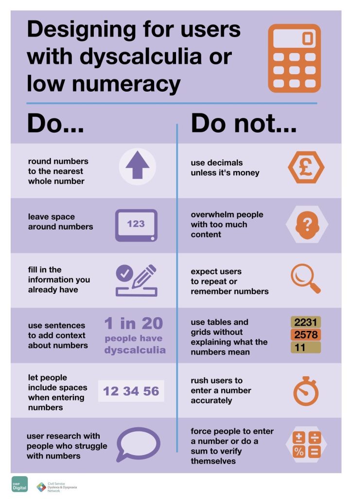
designing-for-people-with-dyscalculia-and-low-numeracy | Designing for people with dyscalculia and low numeracy:
 Read more about Designing for people with dyscalculia and low numeracy on gov.uk page. |