
All is well defined in your image srcset attribute but still loads the wrong image. Let's examine the issue.
Your code for the image looks correct. Everything is defined in the srcset and sizes attributes, but the browser downloads a completely different image than the one you expect. Let’s check why this is happening.
Root causes that are commonly encountered
If the srcset attribute is not working, there could be several reasons for it.
- The browser has already cached the image and is not downloading it again. In this case, you can try clearing your cache, using incognito mode, or adding a random or last modified image file date URL query parameter to force the browser to reload the image.
- Mismatch between the sizes in
srcsetandsizesattributes. Because the browser ignores anything after the first matching condition, the order in which the breakpoints are set in the attributesizesis very important, so be cautious how you organise the media parameters. - The device viewport width may actually be very different from CSS width. For example, iPhone12 have physical width
1170px, but CSS width is390px. It can be calculated usingDevice pixel ratio = (Device physical pixel width) / (Width of a device in a program)and determined in the browser usingwindow.devicePixelRatio.
How does the browser determine which image should be used under some set of media conditions?
Let’s examine following code:
<img
 alt=""
 src="/images/large.jpg"
 srcset="/images/small.jpg 576w, /images/medium.jpg 992w, /images/large.jpg 1920w"
 sizes="(min-width: 575.98px) 100vw,
        (min-width: 991.98px) 100vw,
        (min-width: 1919.98px) 100vw,
        100vw"
/>
The browser then will:
- Determine device width.
- Determine which of the media conditions in the
sizeslist is the first to be true. - Examine the slot size given to the media query.
- Load the image referenced in the
srcsetlist that is the same size as the slot or the first image that is larger than the given slot size if there isn’t one.
What does srcset mean?
The attribute srcset specifies the collection of images from which the browser can select, as well as the size of each image. A comma separates each set of image information from the preceding one. The syntax then is: [filename][space][intrinsic width in pixels]. Example: /images/small.jpg 576w.
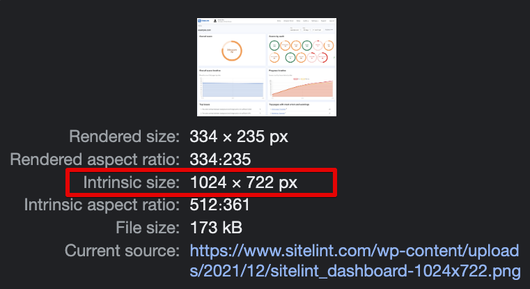
Note that there is w unit, not px. The image intrinsic size is the real image size. You can check that for example in Brave browser by opening developer tools, going to the Elements section, finding the image, and moving the mouse over the image URL. Example:
The attribute sizes
When specific media circumstances are met, the attribute sizes sets up a set of media conditions (e.g., screen widths) and determines what image size to use.
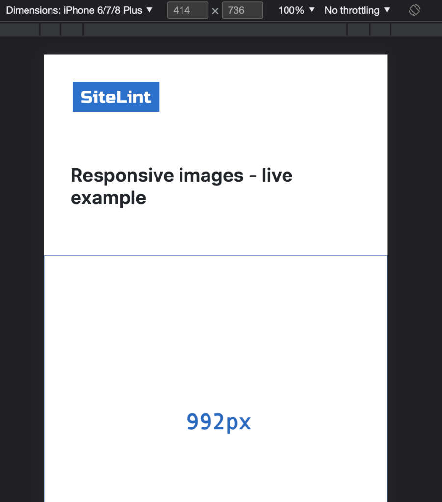
The user visits your site with the iPhone 8 Plus. Which image will be used?
iPhone 8 Plus viewport size is defined as 414px width and 736px height, but the image that is downloaded isn’t what you’d expect. See the example from Chrome browser version 110.0.5481.100 (Official Build) (x86_64):
So, seems like 1px doesn’t mean always 1px. That’s because there are physical pixels and device-independent pixels. So, to get a real viewport size we need to also know the resolution scale factor for the specified device (the ratio between physical pixels and logical CSS pixels).
We need to determine the device pixel ratio. For that purpose use window.devicePixelRatio. Example from Chrome:
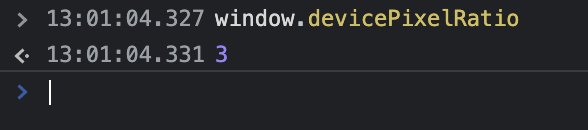
So, we’ve got here scale factor 3. Which is called UIKit Scale
. However, the Native Scale
factor is 2.608.
The real viewport size for iPhone 8 Plus is 1080 x 1920 and it comes from following calculation: 414px x 2,608 = 1080px and 736px x 2,608 = 1920px.
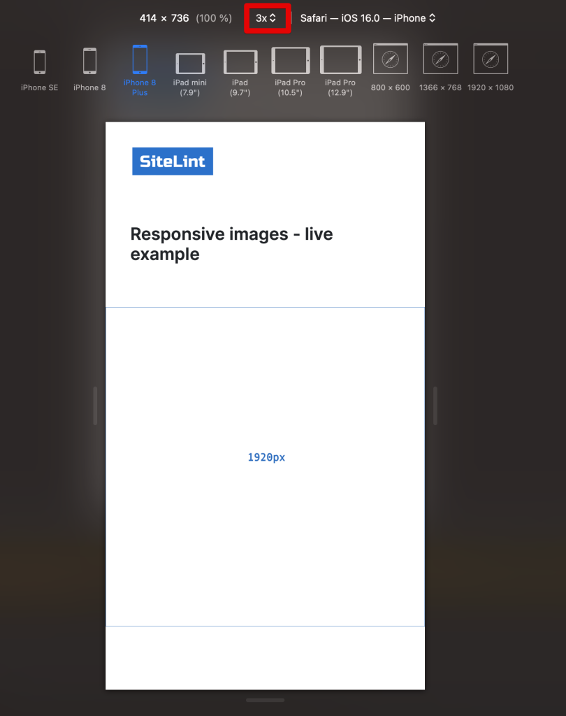
Is there a better way of testing responsive images?
Safari on MacOS and Firefox can be used for responsive image testing. See the example from Safari version 16.3 (18614.4.6.1.6):
Real example
You can test how it works in various scenarios using the following Responsive Images example.
SEO aspects
Google Discover recommends using images with a high resolution, and images that are at least 1200 pixels wide for the best appearance across all devices. While Google does not specify an aspect ratio for Discover, the most widely recommended aspect ratio for best viewing is 16:9. Because of the broad format, the image looks great on all devices and orientations. However, keep in mind that Google Discover may crop the images dependent on the device and user interface, so always make sure the image’s major information is centred and can withstand minor cropping without losing its essence.
On the other side, Microsoft Bing uses deep learning models to enhance image quality and provide stunning, aesthetically pleasing photos. While there isn’t a specific recommended image width, Bing maintains the aspect ratio when resizing thumbnails. For instance, if you specify a width larger than the original thumbnail size, Bing adds white padding around the image as needed. So, focus on maintaining a balanced aspect ratio for your images to ensure they look their best.
Viewport size for devices
See a great guide of viewport sizes for devices including Apple iPhone, Samsung, Tablets, Smart Watches and Android Phones. A detailed comparison list of Phone Dimensions, Screen Sizes and Device Resolution.
Comments