
How to create a custom tooltip with JavaScript, HTML, and CSS that is accessible and styled the way you want.
A tooltip is a widely used feature across the web. Hundreds of different approaches and implementations. The ARIA Authoring Practices Guide (APG) defines the tooltip in the following way:
A tooltip is a popup that displays information related to an element when the element receives keyboard focus or the mouse hovers over it. It typically appears after a small delay and disappears when Escape is pressed or on mouse out.
Another definition of tooltip from Mozilla Developer Network:
A tooltip is a contextual text bubble that displays a description for an element that appears on pointer hover or keyboard focus.
The document Pop Up API (Explainer) indicates that creating a tooltip, contrary to popular belief, isn’t an easy task.
Requirements for creating custom and accessible tooltips in HTML
Let’s take on the challenge of creating a custom tooltip. Before everything, let’s first define the basic requirements for the tooltip.
- Tooltips should only be displayed for interactive elements.
- Must be positioned automatically to fit into the visible area.
- Tooltips must be discoverable and readable with a mouse, other pointer devices, keyboard, screen reader, zoom software, and any other assistive technology.
- Must be triggered by
click,tapandhoverevents. - Should allow the use of HTML. Note: Use only without interactive elements inside.
- Follow WCAG technique
Making content on focus or hover hoverable, dismissible, and persistent
that relates to Success Criterion 1.4.13: Content on Hover or Focus. - Use
prefers-reduced-motionto customize the animation (fade in and fade out) based on the user’s settings. See also Responsive Design for Motion (WebKit Blog) that includes vestibular motion trigger examples.
Notes
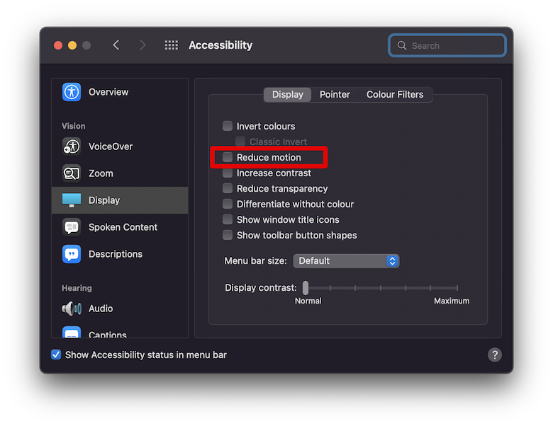
Reduce motion using CSS prefers-reduced-motion
Most operating systems, and by extension, browsers, through prefers-reduced-motion media query, allow us to reduce motion where the user can stop or reduce the movement of some elements on the screen. For those who suffer from vertigo or motion sickness, this feature is extremely helpful. Here is an example from the Mac OS:
How to make tooltips with only CSS?
There are many articles like How To Make Tooltips With Only CSS
, Pure CSS Tooltip | How To Create Tooltips using CSS3
or Tooltips with CSS Only
that describes how to make a tooltip without JavaScript.
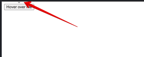
However, while it is possible to create a tooltip that works without JavaScript then the drawback is that you can’t set automatically the tooltip position that must fit into the visible area. See the example when the button is close to the top of the page:
Experimental example
See tooltip experimental example based on Anchor Positioning API and Popover API.
How a screen reader works with our tooltip
We are using <output> element to make tooltip workable with a screen reader.
Frequently Asked Questions about tooltips
Do screen readers read tooltips?
They do read the tooltip, but it all depends on the implementation and what’s being exposed to the screen reader.
How do users access a tooltip?
Through a device type like mouse, pen, touch or keyboard.
Why is it called a tooltip?
Because they are typically used to provide contextual and usage information to the many tools in an application without having to study extensive manuals and other documentation, they are known as tooltips.
Should you put links in tooltips?
Avoid using any links or other actionable elements. Use HTML to add extra semantics like <strong>. Simple text explanations should be included in tooltips. It is no longer a tooltip if you need any links, buttons, or more complex HTML inside of it.
Comments